This is not a 24-hour clock
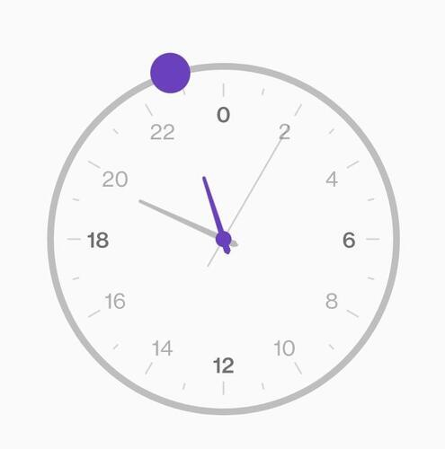
A 24-hour clock should cycle every 24 hours. Seems obvious right? But in a lot of apps, we get something like this:
This is basically two 12 hour clocks jammed together. It forces you to think in lowly 12-hour terms rather than thinking about what part of the entire day cycle you need.
It gets worse too:
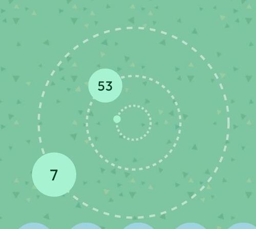
This is Kvaesitso's "orbit" clock when you have the system set to 24h. It's basically just a 12 hour clock with a 24 hour face. The bigger planet still has a 12 hour orbit but it displays 0-23 instead of 12-12.
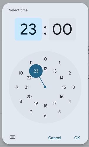
What should a 24 hour clock look like? Behold, one of the few things OnePlus did right in their buggy-ass OS:
0 is at the top, 12 is at the bottom, and it cycles once a day. Glorious.
Comments